Mastering Exploratory Data Analysis: A Comprehensive Guide to Unlocking Insights from Your Data
From Data Cleaning to Visualization Techniques, Tips, and Best Practices for Effective Data Exploration

I am a self-taught Machine Learning, Data Scientist, and Microsoft Power Platform developer.
I remain passionate about exploring the vast potential of these cutting-edge technologies to drive innovation and solve complex problems.
My thirst for knowledge pushes me further to understand these technologies; remain a life-time learner; and push to deliver what is possible with technology while making a positive impact on the world around me.
Technology is continuously growing, and so is the amount of data being made available. Businesses and organizations are also changing how they make decisions. Data is being used to understand business trends and forecast the future. Informed decisions rely on the vast amounts of data collected. The data is, however, valuable, if it is properly analyzed and interpreted.
Exploratory Data Analysis (EDA) is described as the process of analyzing, cleaning, and visually presenting data to understand the patterns, trends, relationships, and anomalies presented. It is the first step in analyzing data and is important to understand before making any decisions.
This guide will provide you with an overview of the EDA process, which consists of data analysis, data cleaning, and data visualization. It will also describe the techniques to identify and handle missing data and errors, the best visualization techniques, and tips for effective data exploration.
Data Cleaning
Data cleaning is the process of identifying, correcting or removing errors, inconsistencies, and discrepancies in data to ensure it is accurate, complete, and useful. The process of data cleaning is very essential, as the quality of the analysis depends on the quality of the data.
There are several techniques for handling missing data, which include deleting the rows or columns with missing values, replacing the missing values with mean or median values, or using machine learning algorithms to predict the missing values.
Data may at times contain outliers, which are data points that are significantly different from other data points in the dataset. The outliers tend to affect the accuracy of the analysis, and it is essential to achieve data uniformity for proper analysis. Statistical measures such as the z-score, interquartile range, and box plots can be used to check for outliers, and remove, or change them.
Data transformation is the process of changing the way data is organized or putting it into a format that can be used to make it easier to analyze. In EDA, data transformation can involve changing the scale of the data, normalizing it, or converting it into a different format. Here, the main goal is to improve the accuracy of the analysis and make the data easier to work with.
Data Visualization Techniques
Data visualization is essential when seeking to visually represent the data, and identify patterns and relationships.
Scatterplot
A scatterplot is useful when visualizing the relationship between two continuous variables. Each point on the plot represents a data point, and the position of the point on the x and y axes represents the values of the two variables. Scatterplots reveal patterns and trends, outliers, and clusters.

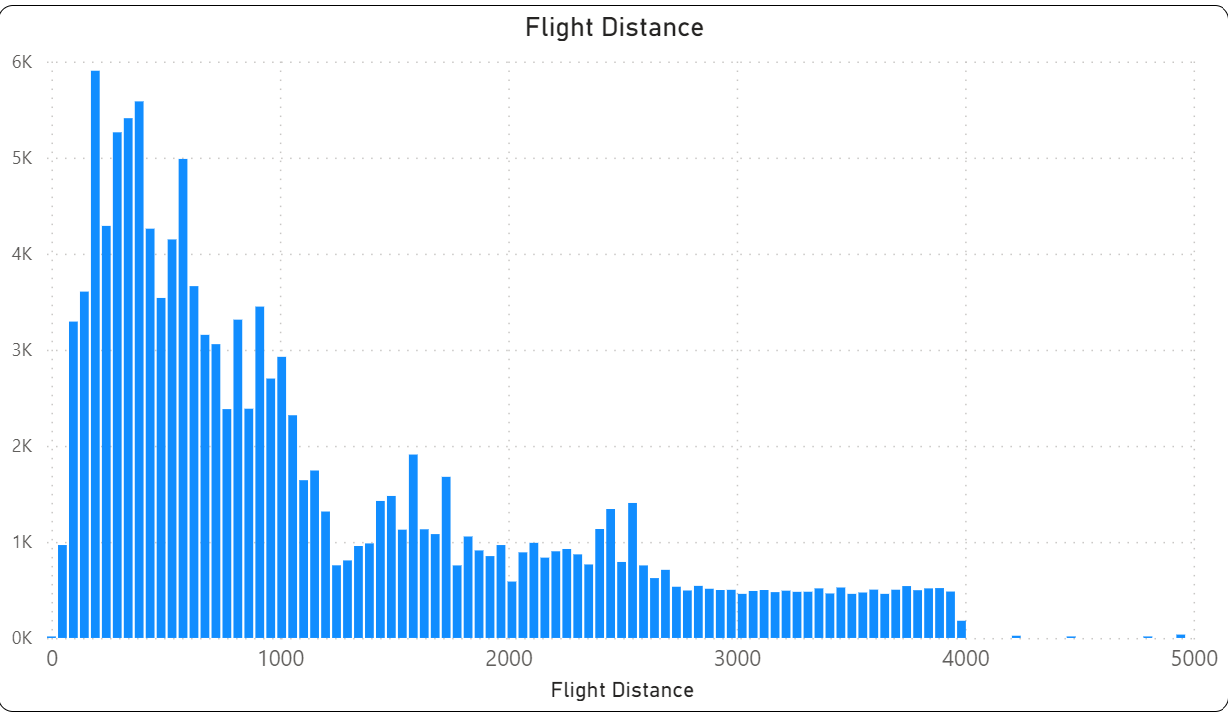
Histograms
Histograms are used to visualize the distribution of a continuous variable, univariate analysis. They reveal the shape of the distribution, and whether it forms a normal distribution, or is skewed. The x axis represents the variable, while the y axis represents the frequency of the data points in each bin.
Box and Whisker Plot
A box and whisker plot is very helpful when seeking to understand the distribution of your data or even compare how the distribution is different in various segments.
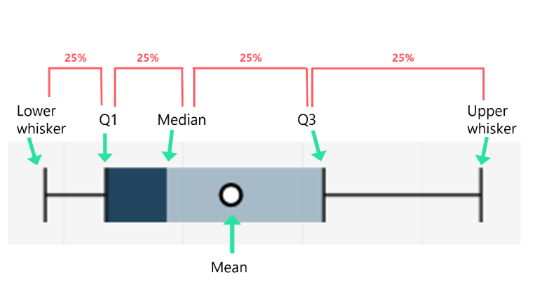
To understand a box plot, there is a line in the middle, or a dot in this case, which represents the median of all the data points. The leftmost part or bottom of each box is the 1st quartile or 25th percentile. The top of each box indicates the 3rd quartile or 75th percentile.
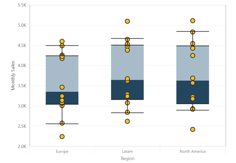
Any data points lying outside the plot are outliers or extreme values.
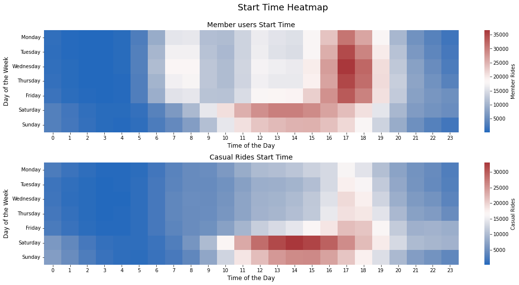
Heatmap
Heatmaps show how much presence of one category concerning another category is present in the dataset. The cells in the plot are coloured based on the frequency or count of data points in each combination of categories. Heatmaps are useful in identifying patterms and trends and can be used to detect clusters and correlations.
Best Practices and Tips for Effective Data Exploration
Summary Statistics
Summary statistics provide and quick and easy to summarize the data and identify patterns and trends. The Mean, mode, median, standard deviation, minimum, maximum, 25%, 50%, and 75% values are some of the results displayed in summary statistics. These measures provide insights into the data and guide the next step of analysis.
Correlation Matrices
Correlation matrices are useful when seeking to understand how various variables are related. The analysis is further tailored based on the objective after understanding the relationship between various variables.
Exploratory Plots
It is important to use the right plot when doing exploratory data analysis. Univariate analysis involves exploring a single variable and the best plots for this type of analysis would be Countplot, Pie chart, Histogram, Distplot, and Boxplot.
Bivariate analysis is the analysis between two different variables. The useful plots are Scatter plots, Bar plots, Boxplots, Distplots, and line charts. For multivariate analysis, which is the analysis between more than three variables, the same plots used in bivariate analysis would be useful.
Conclusion
Exploratory data analysis is an essential step in any data analysis project. EDA helps in identifying patterns, trends, and relationships in the data, which can help make informed decisions based on the insights generated. By following the discussed steps, we can make EDA more effective and gain deeper insights into the data.


